 Gone are the days of a “form over function” internet. Where once the simple novelty of seeing a business online, in any fashion, was often enough. Now, today's more savvy audiences want to get where they are going. So with the priorities of today's business websites being speed and ease of use, here are three tips that can ensure you are providing your customers the information they require in the best way possible to help you make conversions either on your site or in person.
1. Where is the business?
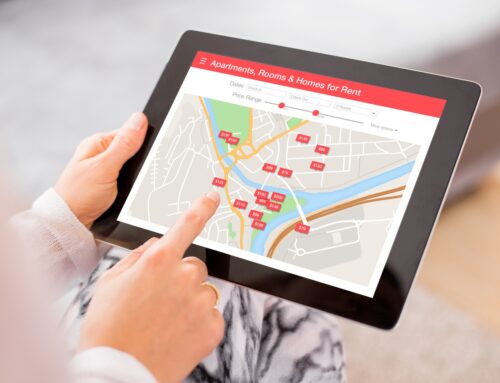
Contact information is the most essential information you can have on the internet. It seems simple enough, yet many well-intentioned websites make this information difficult to find. Studies show that people will tend to look at the top left corner of your website first like they're reading a book. This is where the essential information should be, your contact info—don't make customers scour the page looking for a way to find your business.
There are lots of data you can include in the contact information section. The trick is finding the balance of information overload vs. unnecessary vagueness. There are three things you need to have specifically:
Hours of operation
People seeking this information are likely close to buying, so having your hours of operation listed accurately and in a fashion that's easy to read is a huge priority. Here are two examples, one bad and one good, to showcase how your hours should be listed online
Don't do it like this.
We are open Mondays – 8:00 am-5:00 pm, Tuesdays – 8:00 am-5:00 pm, Wednesdays – 8:00 am-7:00 pm, Thursdays – 8:00 am-5:00 pm, Fridays – 8:00 am-7:00 pm, Saturdays 12:00 pm-5:00 pm and the service shop is also open until 7:00 pm.
It looks hard to read, right? It doesn't look nice, it's hard to look at specific days, and you don't know if the service shop is just open on Saturdays, or if it's always open until 7:00 pm every evening.
A better example
Sales:
Mon 8 – 5
Tues 8 – 5
Wed 8 – 7
Thurs 8 – 5
Fri 8 – 7
Sat 12 – 5
Sun Closed
Service:
Mon-Sat: 12 – 7
Looks a lot nicer, right? It's a lot easier to read and find the information you need. The most important part is to make sure the hours are accurate. Even if it takes an extra line to explain a confusing set of hours better, customers greatly appreciate knowing when they can expect your business to be open.
Address
Unless you're an online retailer, your address is an essential part of your contact listing. But just like hours of operation, there are various ways to share your location. Here is how we recommend it. Provide enough information so that Google maps can locate the business. For people in major cities, often just your street address is sufficient. But if your business is a little tricky to find, consider linking to a map application or have the map right on the website. If you're going in that direction, make sure to use an accredited map engine like Google Maps instead of a hand-drawn creation. People tend to be a lot more familiar with popular map formats and might get confused/scared at the sight of your beautiful artwork.
Phone number
This is the number where customers can most easily reach you. Businesses with multiple departments equipped with individual phone lines might want to stick those on a “Contact Us” page. There's no sense in cluttering your home page with 30 different phone numbers. Businesses should have one phone number on the homepage display to catch any inquiries. Don't forget an area code for those out-of-town customers. Make it easy for on-the-go customers to hit a button and have their mobile device ring the business instantly.
2. Who is the business?
You likely have a lot to say about your business, so the real challenge here is the distillation of your story. Here, think of the company from the customer's perspective; what makes you unique? Why are you better than their competitors? What do you do for customers? These questions will likely shed light on the most vital information to share, at least at the top of the page.
Once you've got your top-level information cased, consider designing a way for interested customers to learn even more about the business. There you can dive deeper into your history, philosophy and share any achievements or media coverage your business has had in its past.
3. What does the business do?
This is where functionality needs to be the highest priority. Customers are looking for confirmation that your business is what they are looking for when they are searching. You can't afford to have this information be anything but concise, easy to find, and extremely helpful. It's challenging to know the exact right strategy for your business, but a tactic we recommend is taking a look at your closest competitors for insight.
Look at that website and assume the perspective of their customer. If you like something about how their website works, make a note. If you find something super-inconvenient or confusing, again, make a note. Have these notes inform your approach.
Conclusion
Many people think a website should be an online version of your business, and in reality, this is virtually impossible. A website is more like a messenger for your business, and it's a tool for relaying information about the business to potential customers. If your messenger is wordy, confusing, and tries to use flashy bright colors to grab attention, the customer will not be engaged. If your messenger relays all the information in a simple, concise, and memorable way, customers will be more likely to engage. It is pretty likely a website is the first impression the customer might have of your business—remember, you only get one chance to make a first impression!
Need more local marketing tips? Check out our entire Guide to Local Marketing for Real Estate Professionals